
Letters, letters everywhere…
From the moment we wake up and look at our digital alarm clock, or at our phone, we are looking at letters. Over breakfast there is lettering on our cereal packets and when we travel to work there is lettering on the destination board of the bus we board, or the Underground train we catch and in the book or newspaper we read. The world is quite simply full of lettering.
Is it a font or is it a typeface?
The Oxford English Dictionary defines a font as a complete set or assortment of type of a particular face and size, so Times New Roman 8 point. The definition for typeface is a set of printing type of a particular design, so Times New Roman. The distinction between the two was clearer in the days when lettering was produced using metal type but in these day of digital printing the two terms have become interchangeable except perhaps by type designers.
The different parts of letters have special names, for example:
Arm: projecting horizontal strokes on such letters as T, E
Ascender : part of a lower-case letter which projects above the mean-line
Bowl: the rounded part of letters as P, B and the upper part of g.
Serifs: These are the small flourishes at the end of letters. They are designed to help the eye flow over the letters more easily.
Lower case letters are so called because they would have been in the lower part of the case that held the metal type, while type for the larger capital letters would have been above, hence upper case.
We never think about it but someone designs all these letters and someone carefully considers which lettering to use in terms of readability, marketing and brand identity.
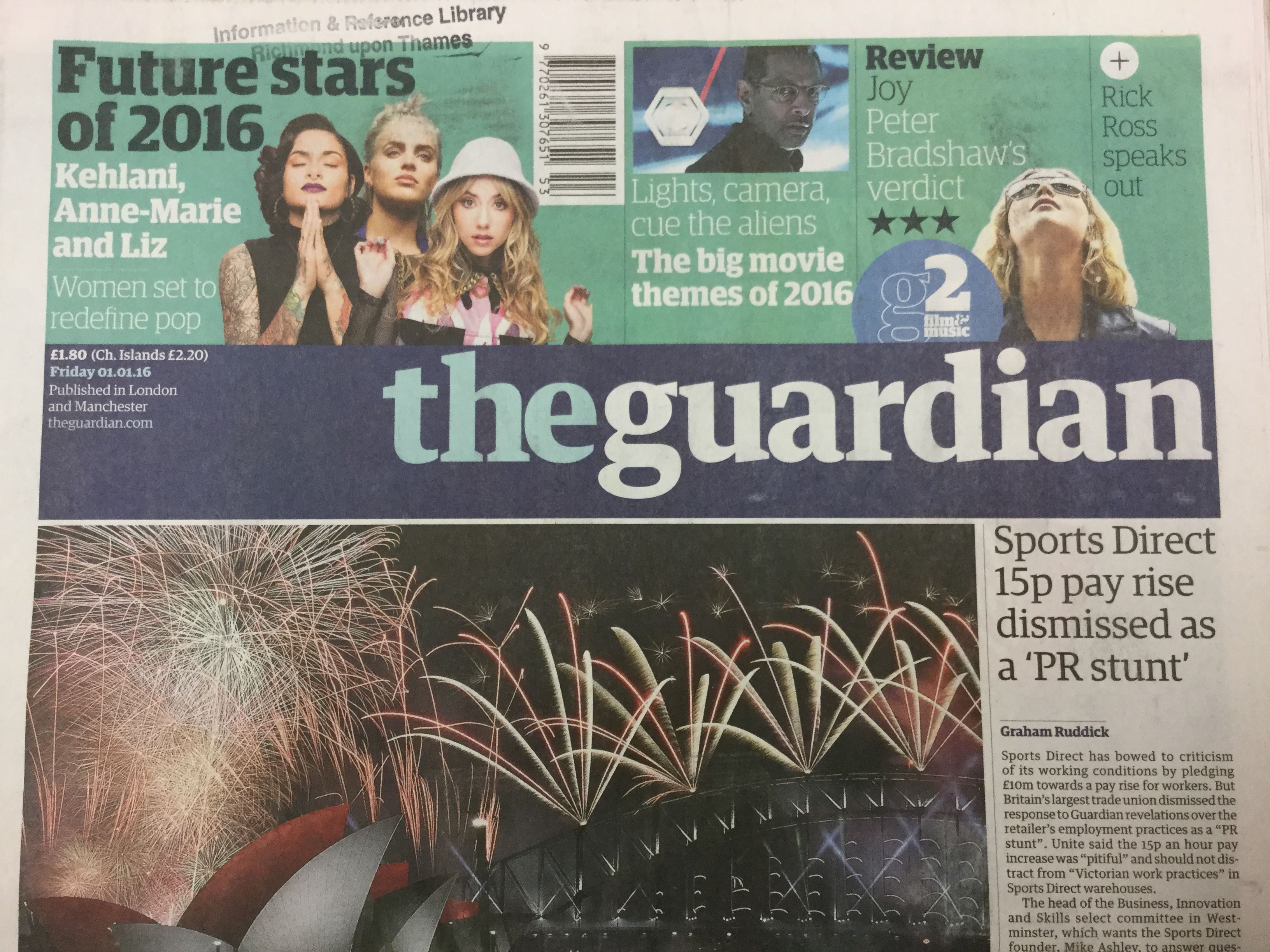
If the newspaper we are reading over breakfast is the Guardian the font we are seeing is called Guardian Egyptian. In 2005 the Guardian changed from using the broadsheet format to the Berliner format – one that is used by European newspapers but never before by an UK newspaper. Part of the redesign was to enable the paper to work better on a digital platform and to this end the number of columns was reduced and a new font, which would work on screen and on paper, was designed exclusively for the paper.
If we were reading the the Times in the 1960s the the font we would be reading would be Times New Roman. This was commissioned by The Times in 1931 and the design was supervised by Stanley Morison of Monotype, and was used until the early 1970s. Monotype have been a leading company in the world of typography since the early C20th.

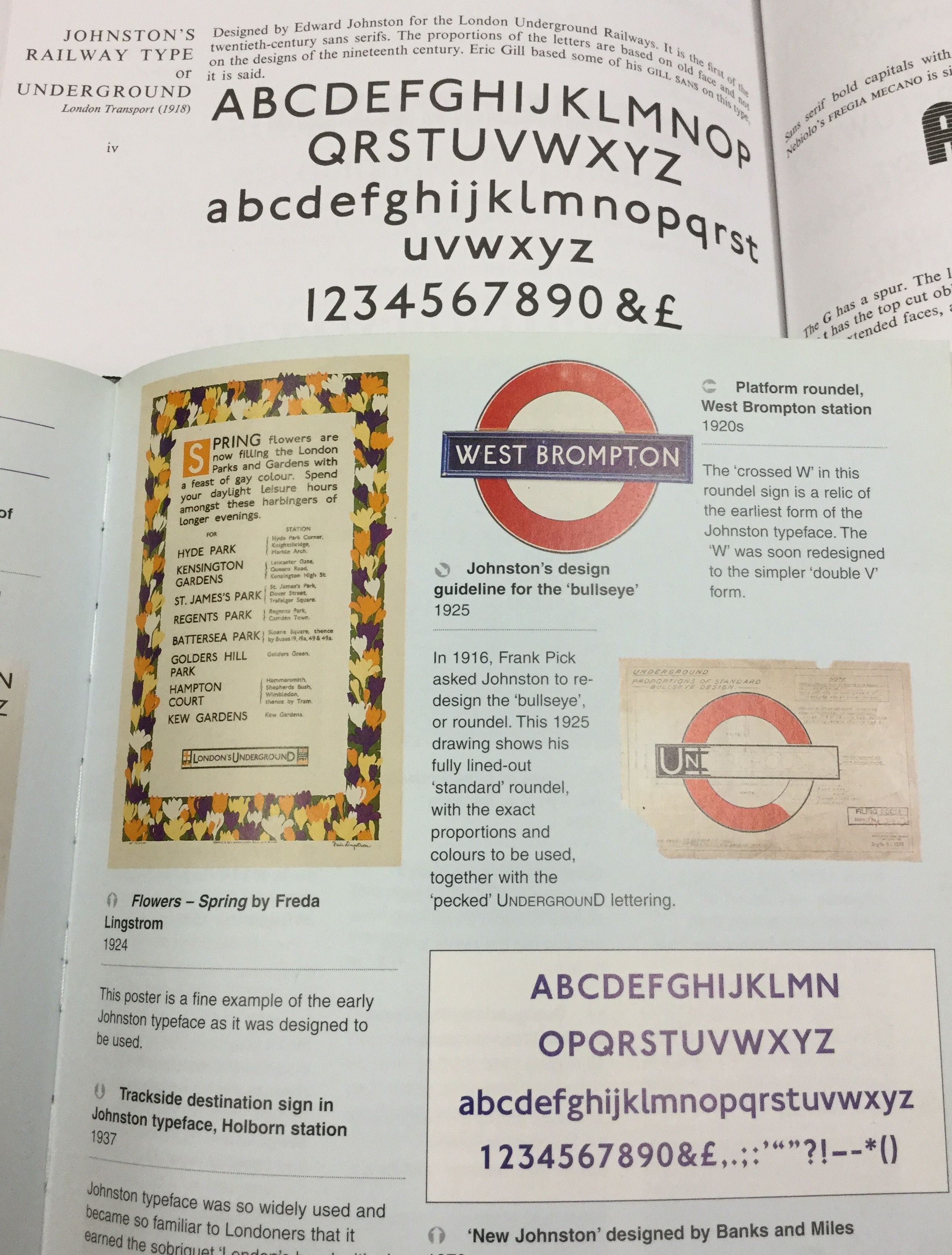
We then leave the home and walk to the bus stop or the tube stations the font that we see on the destination blind of the bus, or on the tube map is New Johnston. This font was designed for the Underground Group by Edward Johnson, who was a calligrapher and a letter designer, and it was first used in 1918 using wooden letter blocks. ( For large lettering wooden blocks were used instead of metal). Initially, Johnston only designed upper case letters with lower case letters being designed in the 1920s. This font has been used ever since by Transport for London and its previous incarnations. The font was redesigned by Banks and Miles in 1979 to be more flexible and adaptable and to cope with the changes in reproduction technology.
Edward Johnson taught Eric Gill who went on to design one of the most famous sans serif typefaces – Gill Sans for Monotype in the 1928 (the original design was for a Bristol bookseller in 1926). This font is used for their logos by the BBC, Benetton and Tommy Hilfiger. In 2015 Monotype expanded the Gill Sans family of fonts and designed a modern interpretation of Gill Sans, a typeface called Gill Sans Nova.
Typefaces come in a large range of styles and they have their own classification system. The English classification scheme, which is contained in British Standards 2961:1967, has nine categories including:
- Script: Typefaces that imitate cursive writing (Place Script, Legend, Mistral)
- Slab-serif: typeface with heavy, square-ended serfis, with or without brackets.( Rockwell, Clarendon, Playbill)
- Lineale (formerly Sans-serif)
It used to be the case that you could easily find out what font a book was set in as this information was on the copyright page, but sadly this isn’t often the case these days and some detective work is needed. One way of easily identifying different fonts is by examining the lower case g which has the greatest variation in its treatment of any of the letters of the alphabet. The Encyclopedia of Typefaces is perfect for this, see link below.

Type-related websites and suggested reading matter
Ditchling Museum of Art and Craft
London Transport Museum
Museum of Brands, Packaging and Advertising
St Bride’s Foundation
Type Archive
The Encyclopedia of Typefaces
Just My Type
New Perspectives in Typography
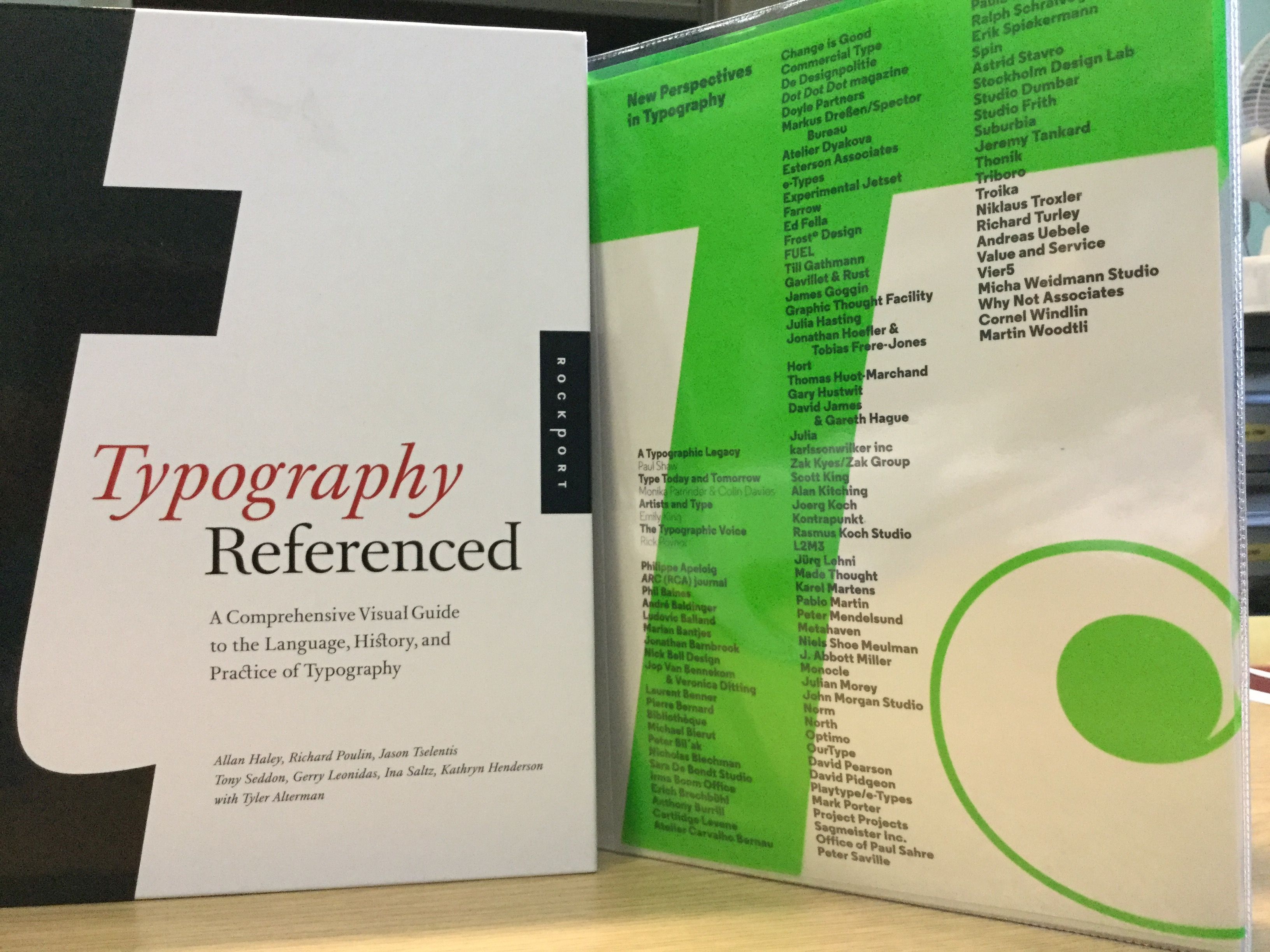
Typography Referenced
Members of Richmond upon Thames Library Services can access the Oxford Dictionary of National Biography to find out more about Eric Gill , Edward Johnston, Stanley Morison by clicking on the hyperlinks.
If you use Pinterest then why not have a look at the Richmond upon Thames Libraries Pinterest board on typography?
[ Fiona Campbell, Library Assistant ]